In this post, I summarize my work on the US Police Violence & Racial Equality dataset compiled by John Miller on Kaggle. This was a part of the 15 week sprint at #ChaiEDA hosted by Sanyam Bhutani and Machine Learning Tokyo. The idea of the sprint was to use exploratory data analysis on the dataset and understand relevant patterns within it. A detailed representation of the task is present here.
In the remainder of this post, I shall write about my thought process while analysing the data and how I arrived at certain conclusions through my analysis. As I would like to save you the pain of a long read, I shall not be explaining the code or the graphs used. These can be viewed in my kernel here.
Methodology
My methodology for analysing the data at hand was fairly simple. It consisted of the following steps:
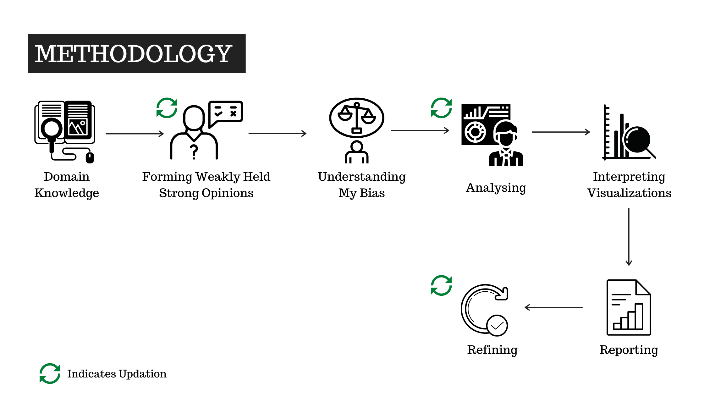
1. Domain Understanding
There was nothing I knew about this data more than what was given in its description. And I also lack any kind of experience in the relevant domain and hence my ability to work with this data was limited. The first task then was to understand the domain in consideration. And by understanding, I am referring to the collection of a wide range of ideas and knowledge born out of different perspectives. Some of the links used in order to attain this level of domain understanding were:
- 12 years of data from NYC suggest stop-and-frisk wasn’t that effective
- Stop-and-Frisk During the Bloomberg Administration 2002-2013 (2014)
- Mapping Police Violence Project
- Fatal Encounters Project
- Officer Down Memorial Page
- The Dallas Shooting was Among The Deadliest For Police in U.S. History
- Police Use of Force Project
- Washington Post - Data Police Shootings
- On duty, under Fire
- What the data say about police shootings
- What the data say about police brutality and racial bias - and which reforms might work
- America’s gun culture in charts
- What the data says about gun deaths in the US
Each of these 13 sources provide different ways to look at the problem at hand. Some conflict minorly, some agree largely. But together, they helped form a rounded understanding of the problem.
2. Forming Weakly Held Strong Opinions
After all that reading, there definitely were view points that I formed in my mind. Well, if I didn’t have any of these it would mean that the authors of these pieces didn’t do their job well. It is their job to ensure that people take their narratives to heart. But, it’s always our choice whether we want to stick to somebody’s version or form a bit of our own too! I came across the “Forming Weakly Held Strong Opinions” through an episode on Shane Parrish’s The Knowledge Project podcast. The fundamental idea is to evolve if presented with more correct facts. It’s to be ready to shift perspective on a problem to identify many more facets of it. This is what I tried doing too. A couple of the strong opinions I formed after these articles:
- American cops are racist and brutal
- The minorities are severely discriminated against and targeted too easily
Towards the end of my analysis, some of these were modified by the data I analysed.
3. Understanding My Bias
First, I would like to disclose that I have no experience with racism. I have never been discriminated against and I have never seen anybody be discriminated against on racial grounds. Therefore, my ideas on this are clearly what I have got of the movies I have watched or shows I have seen or news I have read on social media. Hence, it was important to know how biased I was to my pre-conceived ideas and acknowledge its existence. In order to maintain social etiquette here, I shall skip the part of discussing the biases my mind was fixated upon. The important thing is that I now know why many of those biases were wrong. And I also do realize how some of these were right, but now I have data to know why these were right.
4. Writing Code and Analysis
The entire notebook comprising of code, analysis and relevant explanations can be found in my Kaggle notebook titled Understanding the extent of police abuse in the US.
The code has been written in Python and it uses the following libraries:
The visualizations/graphs used are:
- Pie chart: To compare n quantities (where n<=2)
- Bar charts: To compare counts of values(with or without grouping based on categories)
- Density distributions: To understand the distribution of values in a feature
- Time series plot: To show fluctuation in a quantity with time
- Scatter plot: To compare relationships between 2 quantities
5. Interpreting Visualizations
“The purpose of visualization is insight, not pictures” - Ben Schneiderman
After having the visualizations, the next task at hand was to unearth insights of it. It was important to make these graphs interpretable. Each viz had a different story to tell and understanding what each story meant, why it meant that, how it can be used to improve the current state of things was important. Simply put, the necessity was for actionable insights.
This step required me to pay a revisit to Domain Understanding and it also helped update my Weakly Held Strong Opinions. But I also didn’t want to unknowingly be carried away by a narrative. So, the idea was to have a fact-based overview and connect these quantified bits to form a narrative that was focused on real evidence.
6. Reporting
This was just the part where I had to write about my finds and the steps I took to achieve them. In fact, this article itself is a process to completing this step.
Some of the most important finds of my analysis were:
- The United States of America’s significant usage of guns and firearms is a factor that could be acting as a major catalyst in the large number of gun-related violence. Most articles talk only about the uncontrolled use of arms by officers or the mass shootings. Yet, the most important point to discuss has to be reducing the possession of firearms.
- In majority of the cases when an officer has shot a person, the officer’s life or a bystander’s life has been under immediate danger
- People have been shot and killed in encounters with officers even if they were unarmed and fleeing or carrying a toy weapon. Such killings seem very unnecessary on the outlook(yet, a further understanding is required to understand the truth)
- Every time an officer shoots a person belonging to the minority, it is not necessarily racial bias. But, bias is not absent. In fact, it is very much visible in how officers perceive minorities. To be more clear, “There was a higher chance of a firearm being present with a shot white person than a black person. Yet, more unarmed black people were shot when compared to the whites.”. In the states of California, Texas and Florida that registered the most shooting deaths for the last 5 years, the above statement indicating possible bias holds very true.
- Most people killed in police encounters are teenagers or young adults. Among young adults, most people killed belong to the minority. But in older age groups, more whites are killed than the minorities. This indicates that minorities need not always be problematic as a race. Maybe the youth in these are caught up on the wrong side of things because of the lack of opportunities they have. It’s definitely worth a thought!
- Police officers have always had a difficult life when it comes to maintaining law and order in the streets in the US as indicated by the number of fallen officers every year since the 18th century. However, things are getting better for them now. But, there needs to be more research to understand if cops shoot because of the fear of them losing their lives when encountering a person(who may or may not be potentially dangerous). Especially the history of a cop and his or her victim will help see things way more clearly as to why a shooting happened in the first place.
7. Refining
This is applying final touches to my work before making it public and defining it as complete.
Other Interesting Analysis
Other Kagglers have also produced some very relevant analysis about the dataset discussed. A few of my favorites(in no particular order)are:
- Police Violence in USA, EDA with Tableau by David Dirring
- Don’t Shoot by Raenish David
- Police Policy and the Use of Deadly Force by John Miller
Conclusion
Finally, I also acknowledge that maybe my finds do not conform to what the reader believes in. Yet, I urge the reader to think about the data presented.
Beliefs play an important part in our systems and networks. However, beliefs alone can’t always get the job done. Sometimes, beliefs obscure the truth and misrepresent fallacies as knowledge.